
You’ve heard of fake news. You may not have heard of fake data visualizations. Even educated professionals tend to consider charts, graphs and other types of data visualizations as an extension of statistics – hard numbers that cannot be fudged. But charts can lie. How charts and graphs display information can mislead viewers, either intentionally or unintentionally. The display formats can skew data and, as a result, support a particular point of view or agenda.
PR and marketing pros frequently create charts and graphs for corporate superiors, employees, media outlets, customers and the general public. They review, customize and interpret charts and graphs from media monitoring and measurement services to analyze their efforts and prove their value to management. Public relations and marketing professionals, in particular, must be careful not to create data visualizations that misinform, misinterpret or mislead.
Bad Charts & Graphs are Proliferating
People routinely view charts and graphs circulated on media outlets and social media on the economy, politics and social trends. Although viewers accept them as facts, they often mislead. Even charts and graphs that major news outlets publish can skew data.
Governments, corporations, political partisans and others have become better at creating misleading charts and graphs, Alberto Cairo, professor of visual journalism at the University of Miami, told The Washington Post. Cairo educates people on how to spot misleading data visualizations and wrote How Charts Lie: Getting Smarter about Visual Information.
“A chart shows only what it shows and nothing else,” Cairo told the Post. “Everything else that you see in a chart is often in your brain, not in the chart.”
How to Spot Bogus Data Visualizations
These are some of the most common types of misleading data visualizations and tips on how to spot them.
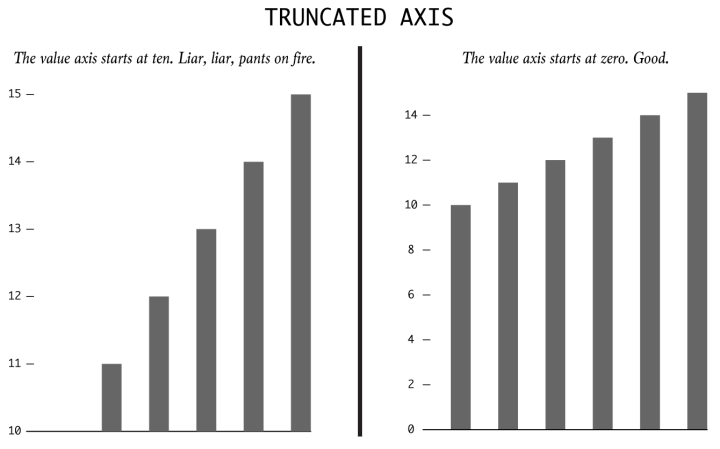
Image source: Flowing Data
The truncated graph. The vertical axis should start at zero. Omitting the baseline is a common trick in misleading graphs. Truncating the axis in bar charts makes the bar length shorter dramatizes differences in values.
Axis changing. Graph manipulators can dramatically increase the scale of the axis to minimize or maximize a change. For instance, a Y axis up to 100 even though all data points are under 10 creates a flat trend line. “This is a very powerful tool on social media and can be used to push a false narrative,” writes Ryan McCready for Venngage.
Dual axis. Axis on both sides of the graph can imply correlation and causation, says statistician Nathan Yau at Flowing Data,. The technique has been used to show such spurious correlations between the divorce rate in Maine and per capita consumption of margarine, the marriage rate in Alabama to whole milk consumption per capita, and per capital consumption of mozzarella cheese to civil engineering doctorates awarded.
Broad binning. Grouping data into larger categories can over-simplify complex data and prompt misleading results, Yau says. While broad binning can be useful, be wary of oversimplification. Although these features don’t prove that a data visualization is bogus, they should set off alarms.
Totals greater than 100. Pie charts and other charts that show parts of a whole add up to more than 100 are implausible. Pie charts represent 100 percent of something.
Limed timeframes. Cherry-picking dates can show outrageous increases or decreases and support favored viewpoints. Long-term views provide more truthful insights.
The wrong chart type. Pie charts that compare the differences between groups can mislead. Pie charts are best to compare parts of a whole. Bar graphs are better for showing differences between groups.
Not following conventions. Darker colors imply greater density; lighter color means less. Red indicates Republican; blue means Democrat. (Political signs and ads in this local election season seem to be deliberately obfuscating party affiliation by reversing conventional colors – at least here in Connecticut.) Numbers on the vertical axis should increase from bottom to top. Inverting the axis produces a wildly misleading chart.
Extraordinary claims. Give extra scrutiny to especially shocking and dramatic charts – and especially if you tend to agree with its conclusion. Follow the mantra: Extraordinary claims require extraordinary evidence.
No data source. If a chart doesn’t mention a data source, ignore it, Cairo advises. For questionable claims, check the source to see if the chart’s message is accurate.
Advice for Creating Better Data Visualizations
Here’s advice on for creating data visualizations that interpret and relay data accurately, are understandable, and get your point across.
Choose the appropriate chart. Using the appropriate chart type is an essential element of data visualization. For showing trends over time, line charts and bar charts are best. Bar charts are ideal for comparison and ranking because they include values on baseline, making it easy to compare values. Scatter plots are ideal for showing correlations between two factors – but remember that correlation does not prove causation.
Pick your numbers carefully. Specific numbers add credibility. In addition, odd numbers are more believable than even numbers, writes content expert Pat Friesen in 8 Tips on How to Make Your Copy More Engaged with Numbers. A statistic of 27%, for example, seems more exact than 30%. You can add a decimal point to make numbers appear more precise.
Label all chart elements. Clearly title the chart, label each axis and appropriately label each trend line or other chart component. The latest software for presentations and PR measurement enables pop-up labeling of chart elements. Make all labels easily readable.
Select colors carefully. Especially in multiple line graphs and circle graphs, choose colors that viewers can easily distinguish. Choose palette colors with the same luminosity – earth tones, for instance, or vibrant tones – to create a better sense of clarity.
Present data with context. For instance, compare numbers to a previous time period. If needed, call attention to the percentage change to highlight the comparative change. Tell viewers what the data means. Explain both what happened and why.
Follow best practices. Follow the industry best practices when using statistics, as published by the Public Relations Society and American Statistical Association. Be clear on how the information was collected and disclose who performed and paid for the work. If survey results are included, show the survey questions.
Bottom Line: Although data visualizations help viewers quickly understand complex numbers, they can lie just as words can. Charts and grafts can deceive viewers, deliberately or accidentally. Spotting data visualization cons and avoiding mistakes that mislead viewers when creating your own charts or graphs have become important skills for all marketing and PR professionals.
This article was first published on Feb. 11, 2017, and updated on Oct. 15, 2019.

William J. Comcowich founded and served as CEO of CyberAlert LLC, the predecessor of Glean.info. He is currently serving as Interim CEO and member of the Board of Directors. Glean.info provides customized media monitoring, media measurement and analytics solutions across all types of traditional and social media.