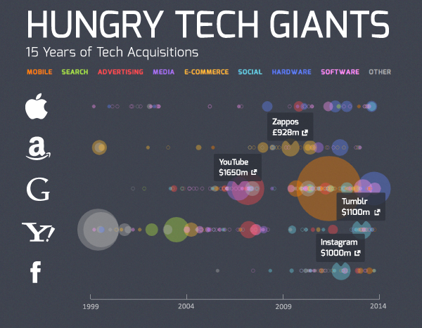
Click infographic image to see the interactive version (via Simply Business).
Interactive infographics are likely to become an increasingly successful data-driven PR tactic in 2016.
Interactive infographics, as the name suggests, allow viewers to interact with the content. Viewers can mouse over, click on and scroll over the image or swipe a touch screen, move or tilt a mobile device to reveal additional information. As Visually explains, most interactive infographics have much more data than standard static data visualizations, enabling users to explore the data for themselves. Viewers can sometimes even enter their own data to personalize the visualization. The format carries within it a next new thing effect that is likely to retain its “wow” power for the next year or more.
High Receptivity by Media Outlets
Major media outlets are posting interactive infographics. The New York Times produced one on how minorities have fared in states with affirmative action bans to support its article on the topic. PR teams that develop interactive infographics can gain an advantage and increase the likelihood that journalists will respond to their pitches and publish the submitted content.
Because interactive infographics require time and expertise to create, most media outlets are more receptive to them. PR teams that build them save media outlets work. Mid-size and smaller consumer and trade publications are especially open to them and often publish them without changes, as long as the topic falls within their subject area and publication’s style. Because of the multilayer format that reveals information in pieces, creators of interactive infographics may be able to include in lower layers corporate or brand messages that might well be rejected by journalists in traditional formats.
In addition, interactive or animated infographics as well as other types of data visualizations can help PR pros communicate data more clearly and effectively. Most people find them easier to understand than long text explanations or endless rows and columns on spreadsheets. Visualizing data helps people understand numbers faster and better, whether on earned media or owned media. With well-designed visuals, the audience can more easily gain insights that were not obvious to them before and incorporate those insights in their decision-making.
Static is an Old Hat
PR, marketing, and the media have already embraced static infographics. Traditional media references the term “infographic,” appears in news coverage about 700 times per day on average, writes Christopher Penn, vice president of marketing technology at Shift Communications, in a Business to Community article. The term is mentioned in tweets, mostly sent from marketers, almost 20,000 times a day. The already widespread use of static infographics by the media may reduce the likelihood of success in pitching static infographics now. The solution to gaining media attention, Penn says, may be interactive infographics.
More Complex to Create
Interactive infographics are more complex to create than static images. They typically require a data analyst to gather, clean and prepare the data for visualization, and a programmer fluent in Node.js, Shiny or other interactive visualization tool to write the interactive code, Penn says.
Vendors offer software packages that they claim can easily create data-driven visualizations from spreadsheets or databases. None, however, are as easy to use or as flexible as the vendors maintain. Standard graphing packages are usually not the best choice for developing interactive infographics and may be too difficult for beginners without programming experience.
The difficulty of creating a robust, well-designed interactive infographic is actually one of its virtues at the moment. Early adopters who design attractive, informative and interesting interactive infographics will likely achieve considerable placement success. As the format becomes easier to create, some of the attraction will be gone.
Bottom Line: PR teams capable of developing interactive infographics can gain a major media placement advantage – at least during the coming year. In addition to gaining more media placements, the data visualization tool can help viewers assimilate the information faster and more easily, and then to retain it better.
William J. Comcowich founded and served as CEO of CyberAlert LLC, the predecessor of Glean.info. He is currently serving as Interim CEO and member of the Board of Directors. Glean.info provides customized media monitoring, media measurement and analytics solutions across all types of traditional and social media.


