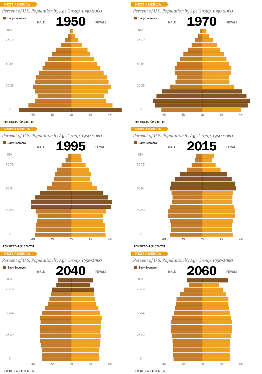
An example of a data visualization showing the growth of the U.S. population. Courtesy of Pew Research Center
Data visualizations – the new-fangled term that refers to charts, graphs and other types of information graphics — help public relations professionals communicate data and messages more clearly and effectively. Endless rows and columns on spreadsheets are far too difficult to grasp for most people. Text explaining data is often messy, unclear and usually boring. Visualizations communicate the meaning of data better than text alone.
Visuals that depict data help audiences understand numbers faster and better. With well-designed visuals, viewers can grasp insights that were not obvious to them before and incorporate those insights in their decision-making.
Visualize the Benefits
PR communications that include data visualizations and infographics stand out and rise above text-only articles and posts. Well-designed graphics also increase the likelihood that an editor will publish your PR submission rather than a competitor’s.
Alexis Hall at TopRank Marketing recalls how her presentation packed with data tables fell flat. Then she redid the numbers as a line graph. “When the day came to remake my case, that line graph immediately won my critics over,” Hall says.
With the rise of big data, data visualizations are more useful than ever. However, a hastily produced image won’t suffice and may even misinform or confuse viewers. Careful research and design are crucial for developing a visual that is eye-catching, informative and factually accurate.
Charts and graphs don’t have to be extremely sophisticated to get their message across or be overwhelmingly beautiful. In fact, simple graphics – er, data visualizations — are often the most effective. Aesthetics are important, of course, but some designers create beautiful graphics that fail to communicate their message well.
Choosing Chart-Making Software
There are many different software packages available to automatically create charts and graphs from spreadsheets or databases. Some, like Tableau recently acquired by Salesforce, are expensive and powerful, enabling creation of entire dashboards containing an amazing variety of simple and complex graphics.
At the other end of the spectrum, Google Charts is free and easy to use even by non-technical folks, but it’s limited in the types of charts it can construct. Visual.ly and Canva bill themselves as simple-to-use tools for building impressive charts in many styles.
ChartJS and DS3 are open source libraries of charting elements requiring some programming skills. Both require knowledge of JavaScript to create charts. The DS3 charting elements can create most any type of chart while ChartJS is limited to six types of charts. Fusion Charts is a long-favored automated graphing package that also uses JavaScript.
Excel, the most common spreadsheet software, can be used to create the basic types of charts for PR communications.
There are also many other graphing packages, some designed to construct only one or two types of complex charts or maps. It’s important for PR departments and agencies to choose and use graphing software that best matches their specific purposes and technical abilities. The most powerful graphing packages are usually not the best choice for beginners without programming experience. For PR purposes, it’s usually best to start with basic graphing software.
Caution: None of the software packages are as easy to use as they claim. Graphing neophytes may want to select a graphing package, but outsource graph creation to an experienced designer.
Choosing Chart Types
Choosing the appropriate type data visualization is essential.
For showing trends over time, line charts, area charts and bar charts are best. Place the time on the X axis and the amount being measured on the Y axis. Line charts do not show the combined amount being measured. For that, use area or bar charts. Area charts show each sector as a single pattern while the bar chart focuses on each year as a single pattern.
Bar charts are ideal for comparison and ranking because they include values on the baseline, making it easy to compare values. They’re also better than pie charts at showing part-to-whole relationships because the human eye is not good comparing sizes in pie charts.
Scatter plots are ideal for showing correlations between two factors – just remember that correlation does not prove a relationship.
Design Considerations
Limit the number of colors and shapes in a single view. Too many colors and shapes in a single graphic can create a confusing, crowded look. Don’t use more than seven to 10 colors and shapes at once – and that’s for a really complex chart. Two or three colors usually suffice, with black or charcoal used for labels.
Avoid more than two color palettes, and use color scales that don’t overlap. Avoid colors with low contrast. People may view the data on different monitors and may be farther away from the screen during presentations. Beware the implicit meanings of some colors. For instance, bright red implies alarm. Pink or lavender often connote feminine.
When picking fonts for online display, stick to web-friendly fonts like Trebuchet MS, Verdanda, Arial or Times New Roman. All are solid easily readable fonts. Sans-serif fonts are favored by most designers for charts.
Key principle: The simplest design approach is almost always the best approach.
More Data Visualizations Recommendations for PR & Marketing
Emphasize the most important data. Accent colors to highlight the most important data points. In scatter plots place the most important data along the X or Y axis.
How charts and graphs display information can mislead viewers – sometimes intentionally, sometimes unintentionally. The display formats can skew data and, as a result, support a particular point of view or agenda. PR and marketing professionals, in particular, must be careful not to create visualizations that misinterpret or mislead. It’s also valuable to understand and avoid red flags of fake data visualizations, such as a truncated axis, limited timeframes and totals greater than 100 percent.
Be sure to clearly title the chart, each axis, trend line and other chart elements. Also include a note on time frame and data source. Make sure all labels are visible and not obstructed by other text.
Effective data visualizations start with a good question. It’s easy to become overwhelmed or distracted by the vast amount of data now available. To stay focused, define your audience and their questions. What question do you want the graphic to answer? After ascertaining the graphic’s purpose, select the data that serves that purpose and accurately represent the facts.
Add context. Unless you’re including it in a presentation, the chart or graph will be viewed without your verbal explanation. Use captions to explain what it means. Is it good or bad? Is it expected? What’s the next step?
Understand your data. If you use data from tools like Google Analytics or HubSpot, understand the nuances of data, such as what’s included in site conversion rates or how you define different types of leads.
Before publishing, run the completed graphic by a statistician in your organization to be sure it doesn’t misrepresent the facts or draw improper conclusions. Once again: Correlation does not mean causation.
Promote the data visualization through social media, email blogger outreach, and media relations. To find people who might be interested, use an SEO tool to find those who linked to similar content, suggests Nabeena Mali, head of marketing at AppInstitute
Word-oriented PR practitioners can follow Tableau’s Visual Analysis Best Practices to create data visualizations that are both attractive and informative.
Bottom Line: Charts, graphs and other types of data visualizations communicate data better than words alone. In an environment that’s increasingly data driven, savvy PR pros now turn to data visualization to help deliver corporate and brand messages.
This article was first published on March 13, 2015, and updated on Aug. 15, 2019.
William J. Comcowich founded and served as CEO of CyberAlert LLC, the predecessor of Glean.info. He is currently serving as Interim CEO and member of the Board of Directors. Glean.info provides customized media monitoring, media measurement and analytics solutions across all types of traditional and social media.


There are a number of ways to represent data like Charts, Graphs, Picture, Symbols, Simple Article etc. But interactiveness is one of the most important features. If data is represented in pictorial forms then it is very easy to understand it. If we simply use static charts for data representation then it does not seems interactive but it gives the full details. For making charts interactive you may use different charting libraries like Koolchart, Free google charts, etc. Data representation is one of the most important option for interactive communication. Simply data alone will not win. “Charts, graphs and other types of data visualization better communicate data than words alone” is totally a proved phrase. Thanks for the information.