Guest post contributed by digital marketing expert Rohan Ayyar.
A landing page is a little like a salesperson trying to clinch a key deal. To maximize the chances of closing the deal and clinching the sale, you need to have your star salesman on the job, not the green horn intern.
In functioning as a salesman a good landing page has a few common characteristics: quick to load, aesthetic and attractive, relevant well-placed images (not stock images), mobile-friendly responsive page design.
However, when a good landing page is just not enough, you need to up your game to create a great landing page. Here’s what it looks like.
The Power of One
We’ve all heard the adage ”unity is strength.” In the case of landing pages, unity of purpose truly is the strength of your page. A page that offers a little bit of everything to cater to every type of user may seem like a good idea in theory, but reality often begs to differ.
As in life, so in landing pages. A laser-sharp focus on a single objective eliminates distractions and points the user towards the most important thing on the page – the conversion element.
Make sure your page has one clear goal, one single call to action (CTA), and a single product (or product category) to prevent distractions and maximize conversions.
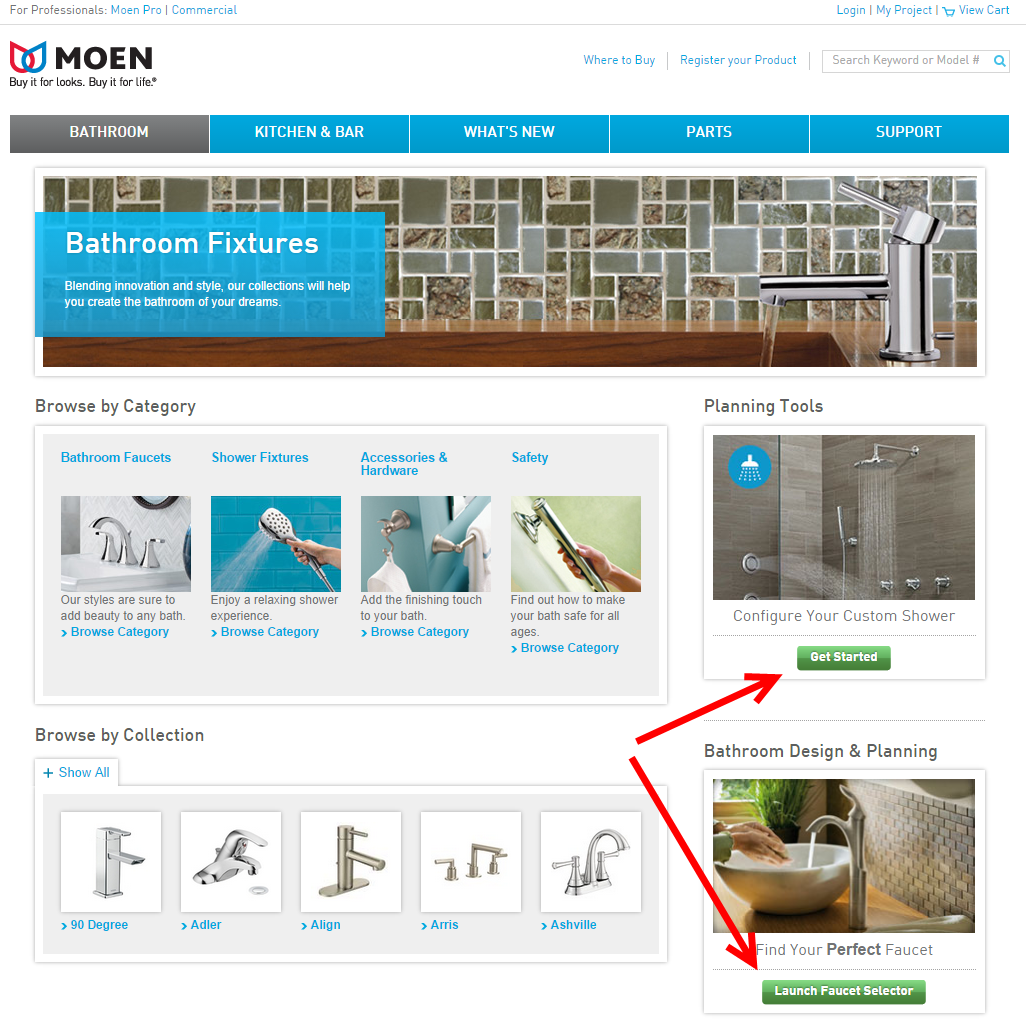
This landing page for Moen bath fixtures seems innocuous to begin with. But when you look closer with an analytical eye, you’ll notice that this one page has two different calls to action. There’s a plethora of things that one can do on this one page – check out specific products, look up completely unrelated product categories, browse through popular products, design one’s own bathroom or pick one’s favorite faucet with a “faucet selector.”
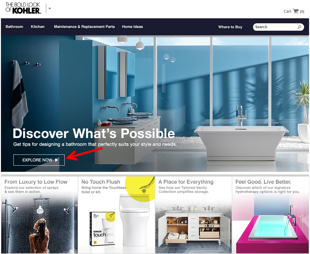
This is a clear example of what NOT to do. At the other end of the spectrum, here’s a landing page by Kohler, with a great lesson on how to design a good landing page.
- Source: Kohler.com
Kohler makes a bold move by not showcasing a single product on the home page, but instead taking on the role of a bathroom expert. There’s a bold headline that arouses curiosity and a single call to action below it that takes the user to well-written articles on the various sections of a dream bathroom and how they can be styled to perfection. And then, in each section, Kohler pitches its best products. Content marketing brought straight onto the website!
Brevity Sells. Try it.
Many landing pages go to great lengths (pun intended) explaining the “greatness” of the brand. The copy examines every imaginable feature to ”convince and convert” as some of our friends put it.
Unfortunately, customers abhor the hard sell. The most successful landing pages avoid that used-car salesman pitch and keep it simple, elegant and most importantly, skimmable. In addition to these styling requirements, the content on your landing page copy must follow three basic rules:
- Have a strong headline.
- Match your content with that of the source from where the visitor arrived.
- Showcase benefits, not features.
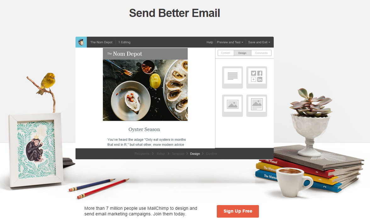
One of my favorite landing pages from MailChimp gets it right. In the screenshot above, you’ll see a single bold headline followed by an example of MailChimp in action – a sample newsletter being designed. Instead of telling a user what they offer, MailChimp shows the user their design capabilities.
The ample whitespace lets users move around and check out the sections that matter most to them. The single “Sign Up Free” CTA grabs the eye thanks to its color. The minimal copy below the fold informs visitors that 7 million people use MailChimp. After a powerful social proof number like that, a visitor needs little convincing to look deeper and decide for herself.
Of Form and Function
The response form on landing pages often puts off readers. With the explosion of data-driven marketing, the mantra for marketers when it comes to data has lately been on the lines of “the more the merrier.”
Asking for too much information at the outset is a turn off. Keep your landing page form as simple and intuitive as possible. Only include those fields that are absolutely essential. It’s a smart idea to offer a clear motivation to the customer to fill up the form such as a free trial. Things like phone number, address, budgets and more are great to know but can be obtained at the next interaction after establishing an initial rapport.
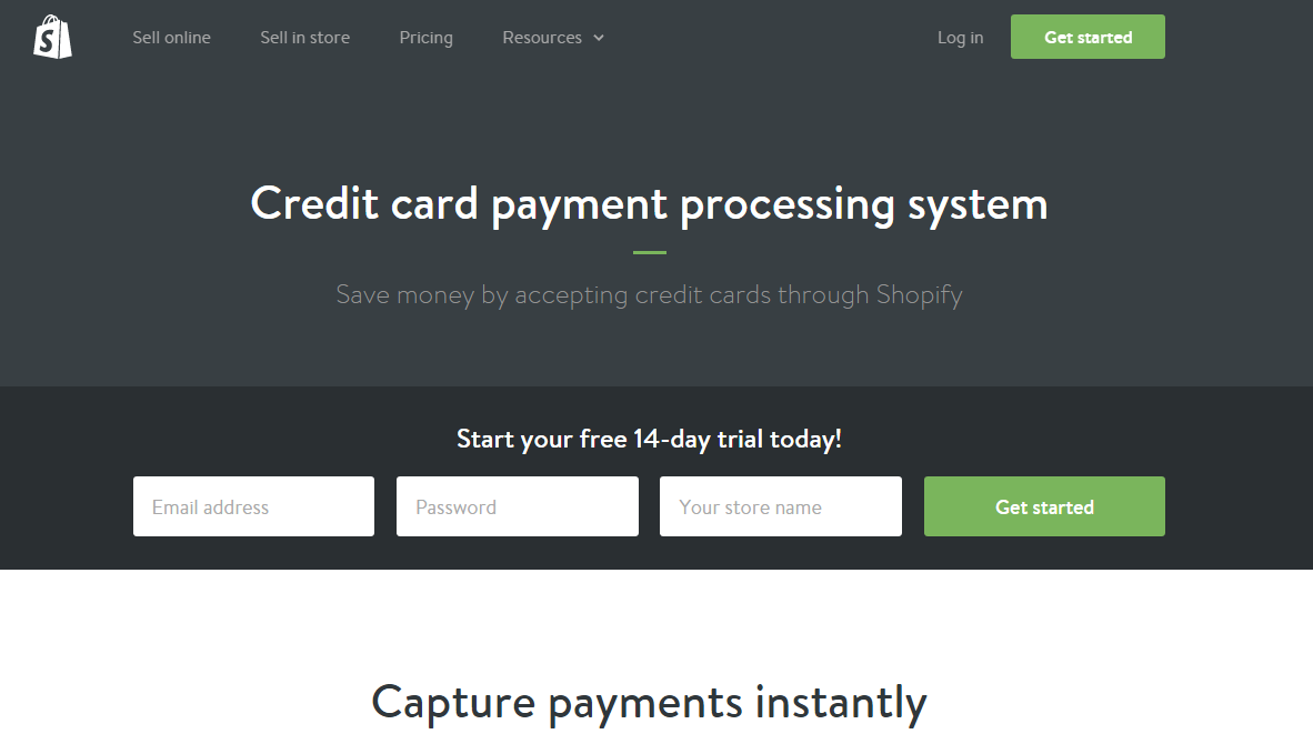
Ecommerce platform giant Shopify follows the “form rules” to the T on its credit card payments landing page. With a keen focus on function and ease of use, the form asks for just the visitor’s email, ID, password and store name – no first name, last name, username, phone number or other such daunting details that may make a user abandon the page. It offers a juicy carrot to the user in exchange for their information – a free 14-day trial.
Drop Names to Establish Credibility
No matter how well or how loud you blow your own trumpet, there’ll always be a doubt in your visitors’ minds about the validity of your claims. To overcome that element of distrust, use social proof to bolster your claims.
Showcase awards or honors bestowed upon your brand by renowned and credible sources. The trust that the visitor has in these big names will rub off on your brand by association. After all, whom would you trust with your beloved pet – The American Kennel Club’s 2013 Winner of “Best Pet Hostel” or some random pet hostel you found with a Google search?
Get your existing customers to offer testimonials about their experience with your business, the quality of your product, your service levels – the works. Customer endorsements, as long as they are authentic, help visitors make up their minds about your brand and aid the final purchase decision.
Consumer reviews are significantly more trusted (nearly 12 times more) than descriptions that come from manufacturers, according to a survey of US internet users by online video review site EXPO.
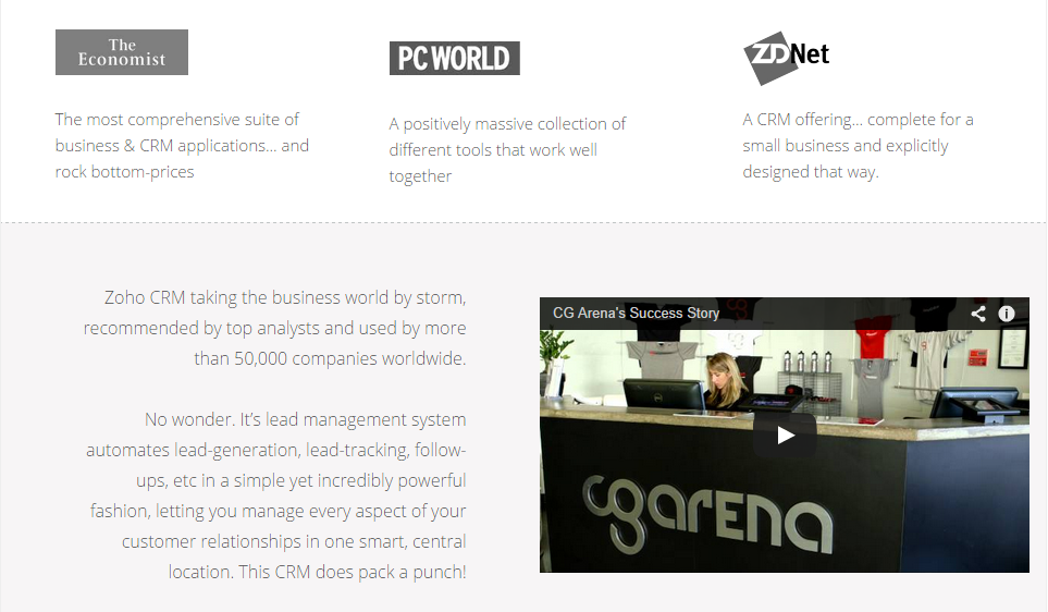
Zoho CRM uses a perfect mix of honors and mentions by respected entities upfront and following them up with a personalized testimonial video of a real user. The fact that it’s not a bland quote with a name or a mugshot, but a video makes the testimonial immediately believable.
The customer goes on to explain why they use Zoho, why they find it better than their earlier system of CRM and how Zoho has helped their business in specific tasks and functions.
Wrapping Up
One thing that a great landing page definitely is NOT is unchanging. Test every element of your landing page constantly, both by itself and how it interacts with the other page elements to contribute towards conversions.
With changing user preferences, updates in search and social media algorithms and a dynamic, competitive environment, the only kind of landing page that succeeds is not one that is perfect, but one that is a constant work in progress.
Rohan Ayyar is a project manager at E2M solutions, a digital marketing firm.




Hey, I personally like your post, you have shared nice information about great landing page examples.