Editor’s Note: The following article is a guest post submitted by Rohan Ayyar of E2M Solutions.
Marketers constantly hunt for the next silver bullet that will magically kick-start a flow of customers to their websites.
Sadly, we all know that no such silver bullets really exist. Massive site traffic, great conversions and lasting brand loyalty are all consequences of many different factors working in concert.
While we spend huge amounts of time analyzing and optimizing the big picture marketing tools like social media, PPC advertising, email marketing, content marketing, even website design, we sometimes neglect the little things that have the potential to make a real difference to your bottom line.
One such “little thing” is your web form.
Web forms come in many shapes, sizes and “forms.” From collecting email IDs with a whitepaper download to letting users subscribe to your blog, capturing shipping and payment details on ecommerce websites to getting conversions on a landing page, there’s just so much that a web form can do.
Let’s take a look at the many ways that this humble but powerful webpage element delivers optimal results.
Faster Checkouts
If there is one problem that is common across most ecommerce sites, it’s the abandoned shopping cart. The Baymard Institute pegs the figure of shopping cart abandonment worldwide at 68%. That’s over $3 trillion in lost revenue for 2014 alone!
A good chunk of this 68% of users drop out because they are intimidated by a daunting checkout process. Checkout forms can make or break an ecommerce site’s conversion rate. From creating an account with contact details to payment information and shipping details, the checkout forms must be easy to navigate and request only information essential to making the sale.
Usability experts agree that checkout processes are best kept short and sweet to maximize the chances that users complete the process. Further research from Baymard Institute shows that on an average checkout processes comprise of 5.08 steps. This means you need to aim for a checkout process that is well below this figure if you want to reduce users’ pain and stand out from the competition.
The Nordstrom checkout process illustrates the principle. A single-page checkout asks for a user’s personal details only on three occasions in the entire checkout process.
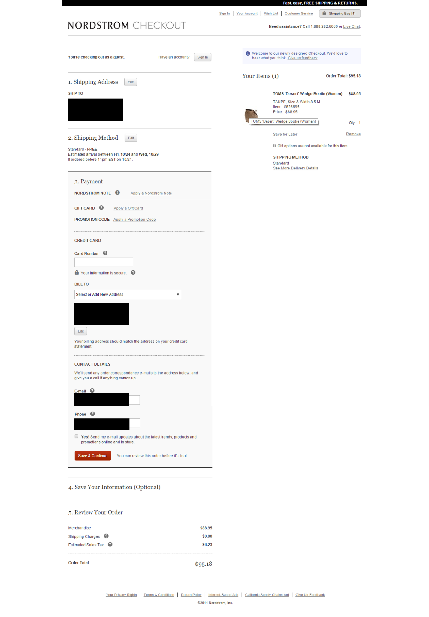
That’s quite a feat for any ecommerce site!
Some key things to keep in mind to build a great checkout form:
- Keep the form short. No one likes being quizzed about the minutest details of their lives. Only ask users for those details that you absolutely cannot do without. Once you have contact details, you can get additional information later.
- Offer tips for filling out specific form fields to prevent errors and wasted attempts.

- Auto-fill details wherever possible. Not only does this crunch steps and save time, it also saves the user the frustration of having to fill in the same data over and over again.
- Use persistent forms so that the user does not lose data they entered when they leave your page and return after a day or two.
Designing Forms for Improved User Experience
A smooth and pleasant user experience (UX) improves website conversions. Considering the number of times a user encounters web forms across an average website, it becomes an important page element that contributes to the overall UX of the site.
The most fundamental function of a web form is to capture data. A good web form is not just about fields and check boxes, it is about helping users offer you their data in the most efficient way possible. Optimize your users’ experience with your website’s forms by taking these steps:
Don’t enforce registration. Always offer guest checkouts.
Use language that explains what is needed of the user as succinctly as possible.
Enclose your ecommerce checkout forms in a separate module or box with borders to negate distraction caused by navigation bars, banners, etc.
Don’t pre-tick boxes that ask for users’ consent on receiving promotional material. It’s a sneaky practice and not looked upon kindly.
Place web forms in strategic locations across your web properties – on your landing pages, on blogs and social networks, on the home page, on a lightbox as the user arrives on or leaves a page, etc.
Plug Security Loopholes
Web forms may seem innocuous enough to you and me, but to the “devious” mind, a web form can be a vulnerability to be exploited.
Allow me to explain. An unsecure website form is a commonly used and easily exploitable website security flaw. Hackers can gain access to individual user accounts by hacking into login web forms using an SQL Injection.
The data like “username” and “password” in forms is actually being entered into a SQL database command. By entering vulnerable SQL code, a hacker can easily override the username and password gateway to your site and fool the web form into allowing them access to your secure data in the customer database. Secure web forms (identified by https:// at the beginning, not just https://) are essential to all ecommerce sites.
Another way hackers misuse web forms is by injecting SQL commands into search forms on websites to retrieve critical data like credit card information of users or email IDs and passwords of users and so on.
Then, there are error messages. These could prove to be a key entry point into your website for bots and hackers. For example, specifying exactly what part of a login attempt is erroneous gives a clue to exploiting your login wall. A message that says “Check your password and try again” basically tells a potential hacker that the username they typed in is correct and all they need to do is focus on getting the password right.
Strike the right balance between being helpful and too explicit by coming up with messages that tell the user what to do next, without being too obvious about the structure and code logic of your site.
Finally, how do you protect your website in general from such attacks? Here are a few ideas:
If you’re developing your site from scratch, make sure you use developers who really know their stuff when it comes to the latest in website security
If you’re using a CMS such as WordPress or Magento to build your website, update the versions regularly. Most CMS providers offer security patches to cover new vulnerabilities that they discover. Web forms are one of the key elements they focus on, knowing they are a soft target for hackers.
Use a strong website security software like Fireblade that will not just offer protection, but also carry out regular code analyses and send updates of potential threats detected before they can do any harm.
Validate data filled into web forms by using a two-step authentication process wherever necessary, for example by using email ID and phone number.
A web form is one key element of the many little things that contribute to a website that converts like magic. What other “little things” do you focus on that have given you results?

Rohan Ayyar is a project manager at E2M solutions, a digital marketing firm.